CHALLENGE: How can we save time and be efficient when adding items to an Inventory Coordinator’s daily order?
MY ROLE: Research, Wireframing, UI Design, and Prototyping.
TOOLS: Figma, sticky notes, pencil, and paper.
DURATION: 2 Months
Overview
Genesis is a new program that has recently been rolled out to Providence Health Care. It was the most quickly developed program to go live. Feedback and improvements to the program are needed in order to adapt to the growing demands and needs of the hospital staff.
The Challenge
The purpose of this case study is to find a more efficient solution for Inventory Control to be able to add and edit orders in the Procurement window. A redesign would optimize the workflow in order to complete IC’s daily order.
Design Thinking
Identify
Observation
As an Inventory Specialist, based on my experience ordering products, I felt restricted in navigating the program and determining where to add and edit an item to orders. After multiple attempts of determining how to add and edit items to an order, it became apparent to me that there should be a more efficient way of completing simple tasks.
The following screenshots are based on the current UI
Research Plan
I collected feedback from Inventory Coordinators regarding their experience using Genesis. ICs were unhappy with having to open multiple windows as well as the time it took to complete what should be a simple task of ordering and editing products. As a UX Designer, I wanted to evaluate the current interface, resolve the most common issues that ICs ran into with using Genesis, and ultimately to have a more efficient way of ordering products so that more time could be allocated towards other critical business needs and projects.
Objective
Determine pain points users faced while trying to add and edit items.
Evaluate user experience, specifically within Procurement, with the Genesis app.
Define
User Interviews to Pain Points
I conducted interviews with my colleagues and received feedback on how difficult and time-consuming it was to order products. The interviews, in addition to my experience using Genesis, helped to determine what the pain points are.
Ideate
User Flow
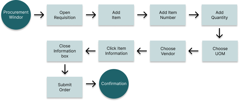
I created a user flow to describe the steps a user would need to go through in order to add an item in a requisition when completing an order.
Sketches
Early design sketches were drawn to see how my idea would be navigated when adding or editing an item, as well as finding items in the existing database to prevent double ordering (and additional expenses for the hospital).
WIREFRAMES
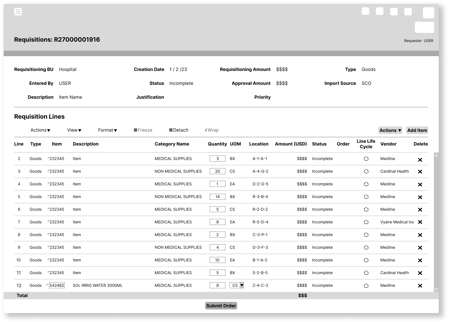
After running user tests and evaluating feedback from my colleagues, I added item locations as this was in the former program and I found that to be helpful.
UI Design
In Genesis, we’ll start at the procurement application. For the changes made on the procurement page, I placed the Purchasing News section on the top with all the links shown as it was often missed or overlooked by staff members. For the current design, the links are almost unnoticeable unless you scroll down in the small frame it’s in. I also moved the Smart Forms Non Catalog section on the right side and made it more visible to the user. This was a similar problem users were having trying to locate the Non Catalog section because they would need to depend on the user screen, the bottom half was often overlooked. The redesign contains all the information, is more visible, and easier to locate.
Final Mockup
Prototype
Testing
During testing, the redesign address the problems mentioned by my colleagues by first making the procurement page more clear and with visibly marked links. Secondly, during the ordering process the user can now easily add and edit an inventory item to their par while also checking the status of all existing products in the order.
Solution
The Genesis procurement redesign will allow the Inventory Specialist to save time when placing orders and also quickly and efficiently view existing order levels and inbound quantity without replenishing or ordering more than needed (saving the hospital from additional expenses).


